Mozaika
Mozaika will help you organize data & analytics assets and products into a Netflix-like catalogue. Let your folks effortlessl…
I DESIGN 2023 is a report created for the I DESIGN charity group. Using a wide variety of visualizations, the report presents key moments of the group's year, spotlighting its flagship initiative: an annual UX design conference.
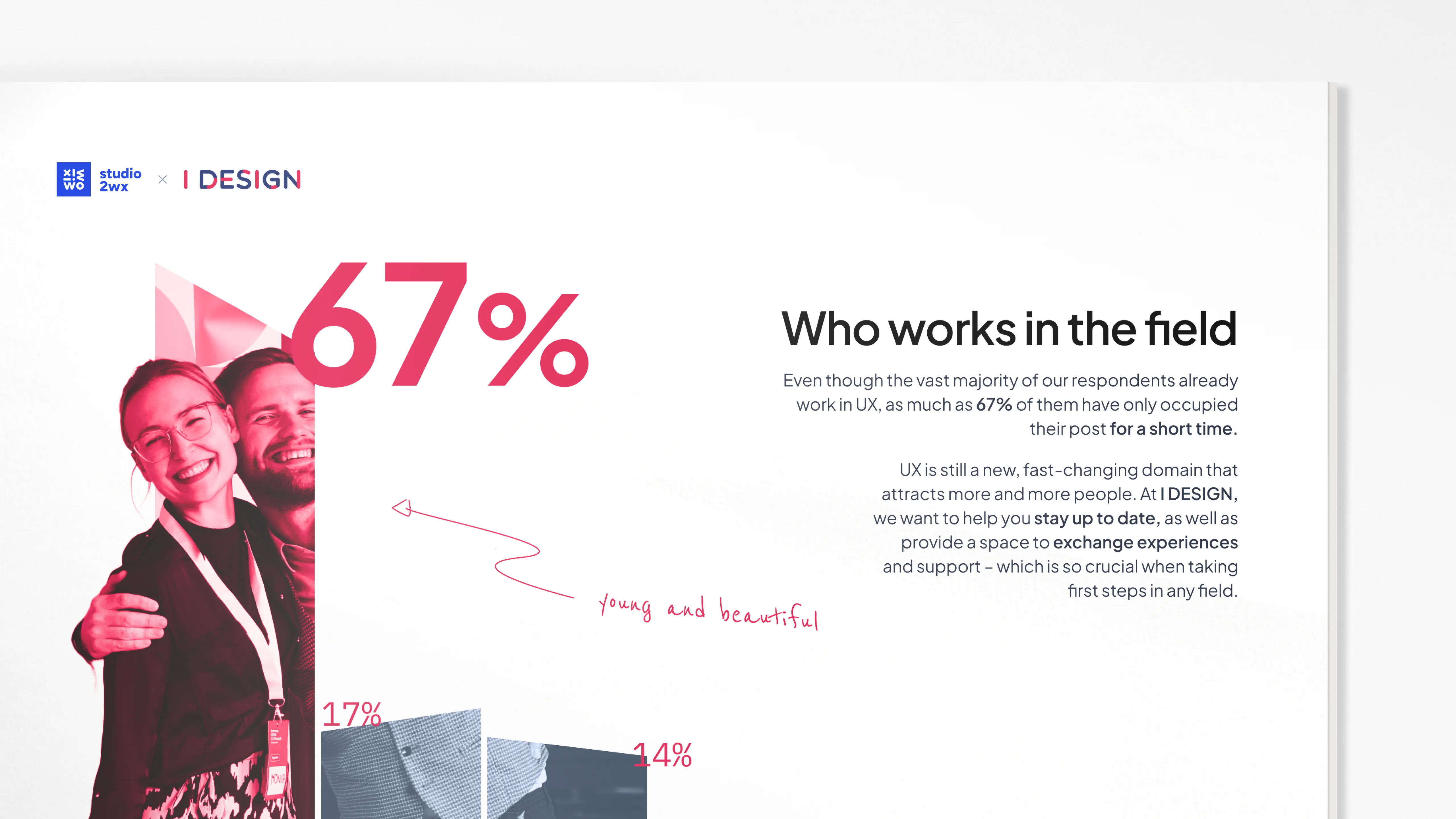
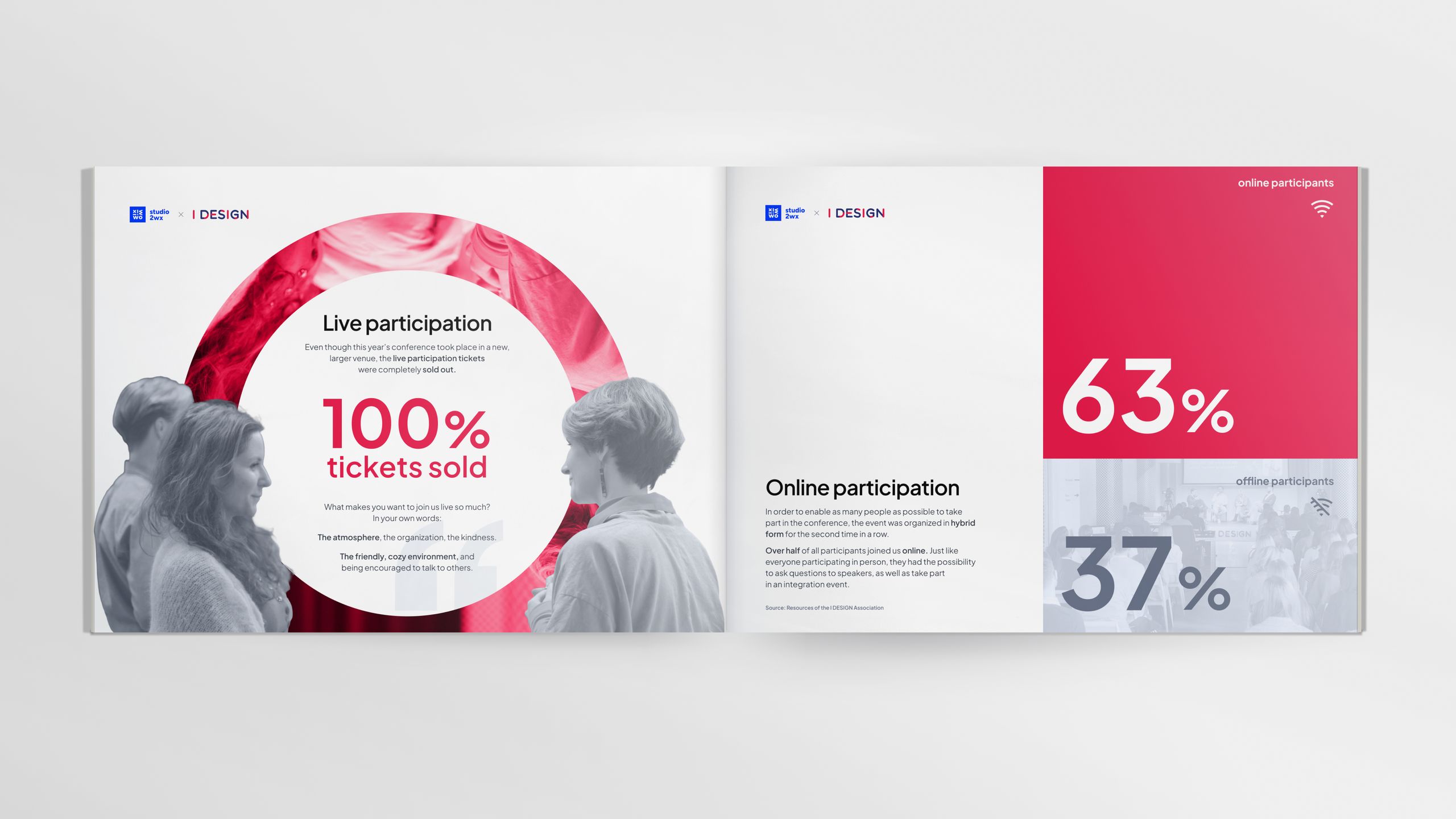
The I DESIGN society is a Polish non-profit group that organizes educational events related to UX design – the biggest one being an annual conference taking place in Wrocław. To find out more about the conference participants and further promote the event, I DESIGN asked us to create a report summarizing the 2023 edition.
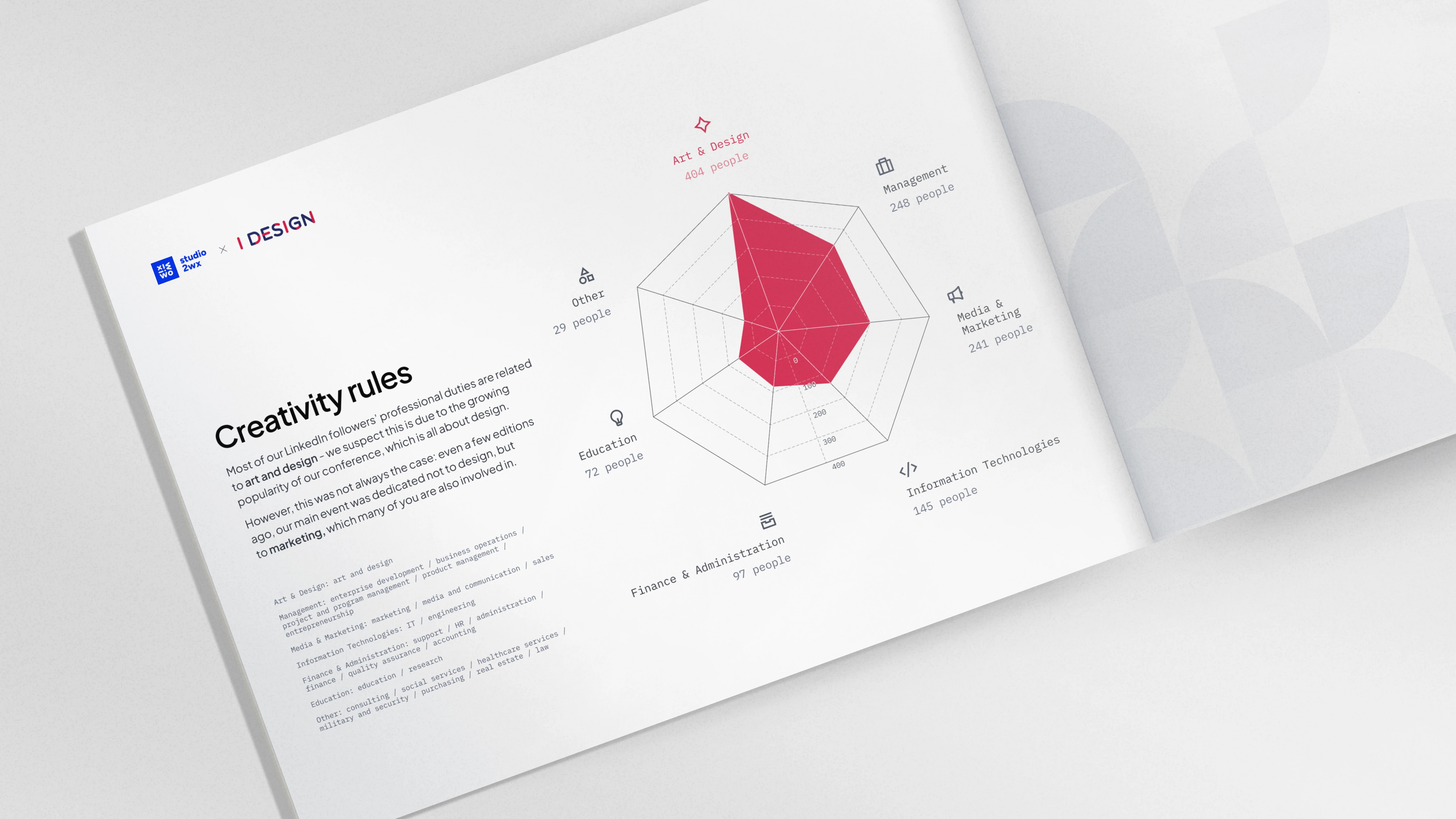
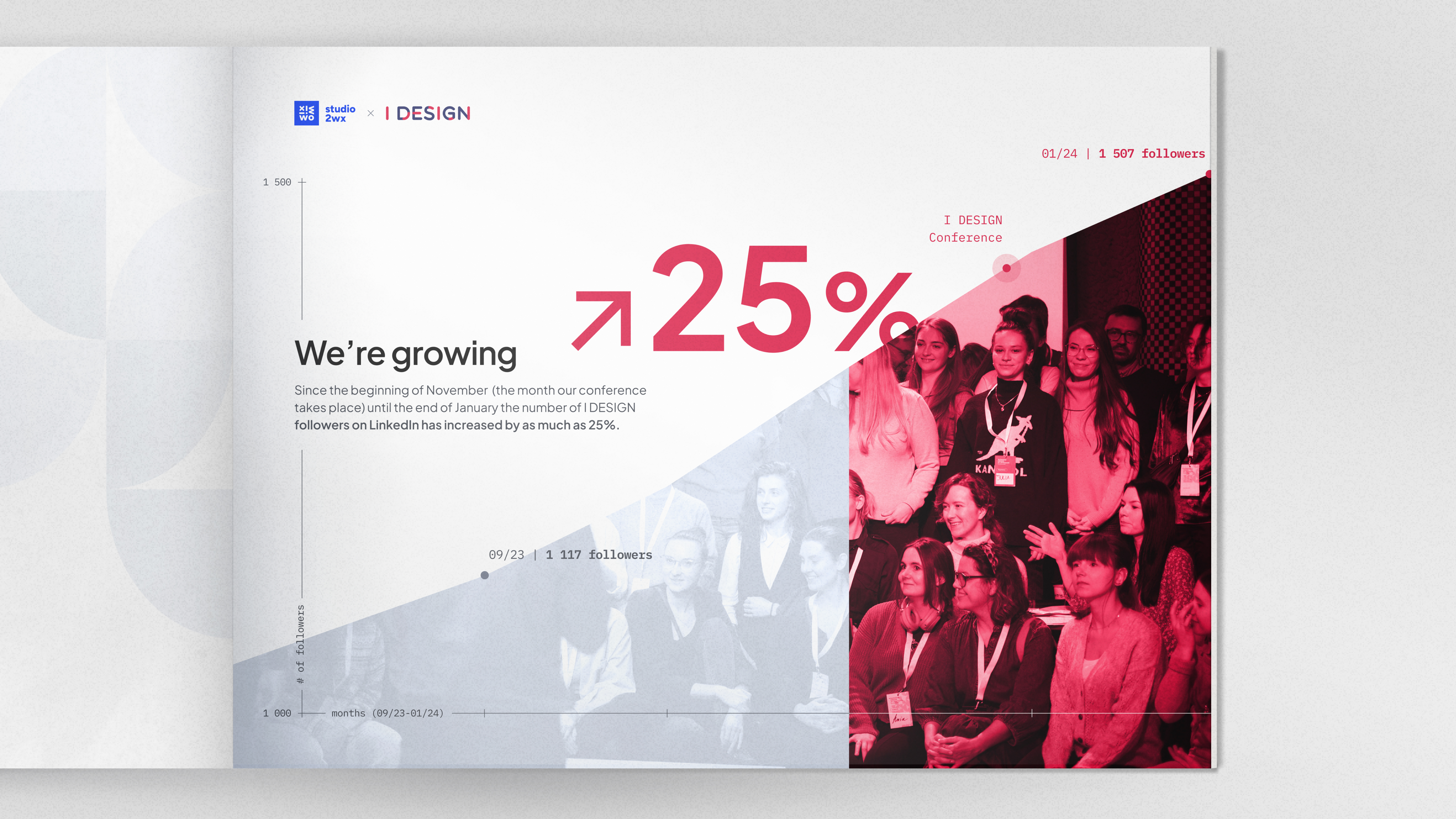
The conference participants filled out two surveys, the results fo which became our main dataset. We started out by checking if the answers were predictable or surprising, looking for patterns, outliers and connections in the data. At the same time, we were asking ourselves about the main takeaways. What is the data saying? Which insights are worth showing? How can we tie them in a logical sequence? Only after drafting a basic script, and knowing which answers we wanted to show together (like the participants’ age and gender), we were ready to sketch the first visualizations.
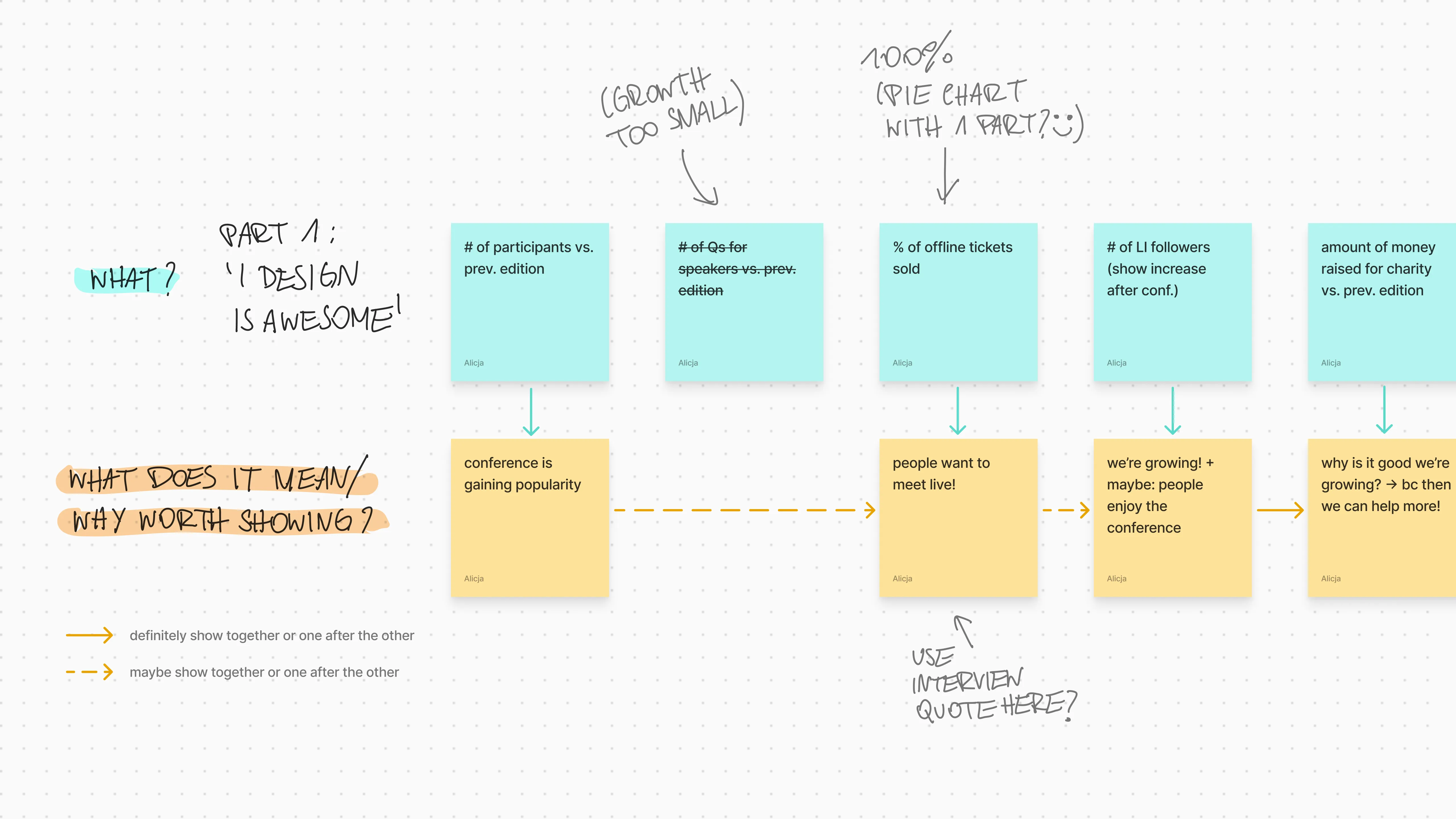
Complex infographics can be eye-catching and engaging, but in this case, we wanted our data to be self-explanatory above all else, as it would be many peoples’ introduction to I DESIGN. In general, it’s easiest for audiences to digest information when it is consumed in small chunks; that’s why, instead of an infographic, we decided to create a presentation. Each slide could then make a single clear point, and make it in a compelling way. We also divided the entire presentation into thematic blocks, which, while forming a cohesive whole when put together, were still clear on their own and could be published separately.
As for the overall look of the project, our client left us a lot of creative freedom. After looking at plenty of inspiring content, related both to deck design and creative data viz, we came up with some rules to help us make the slides look as good as possible. We decided to:
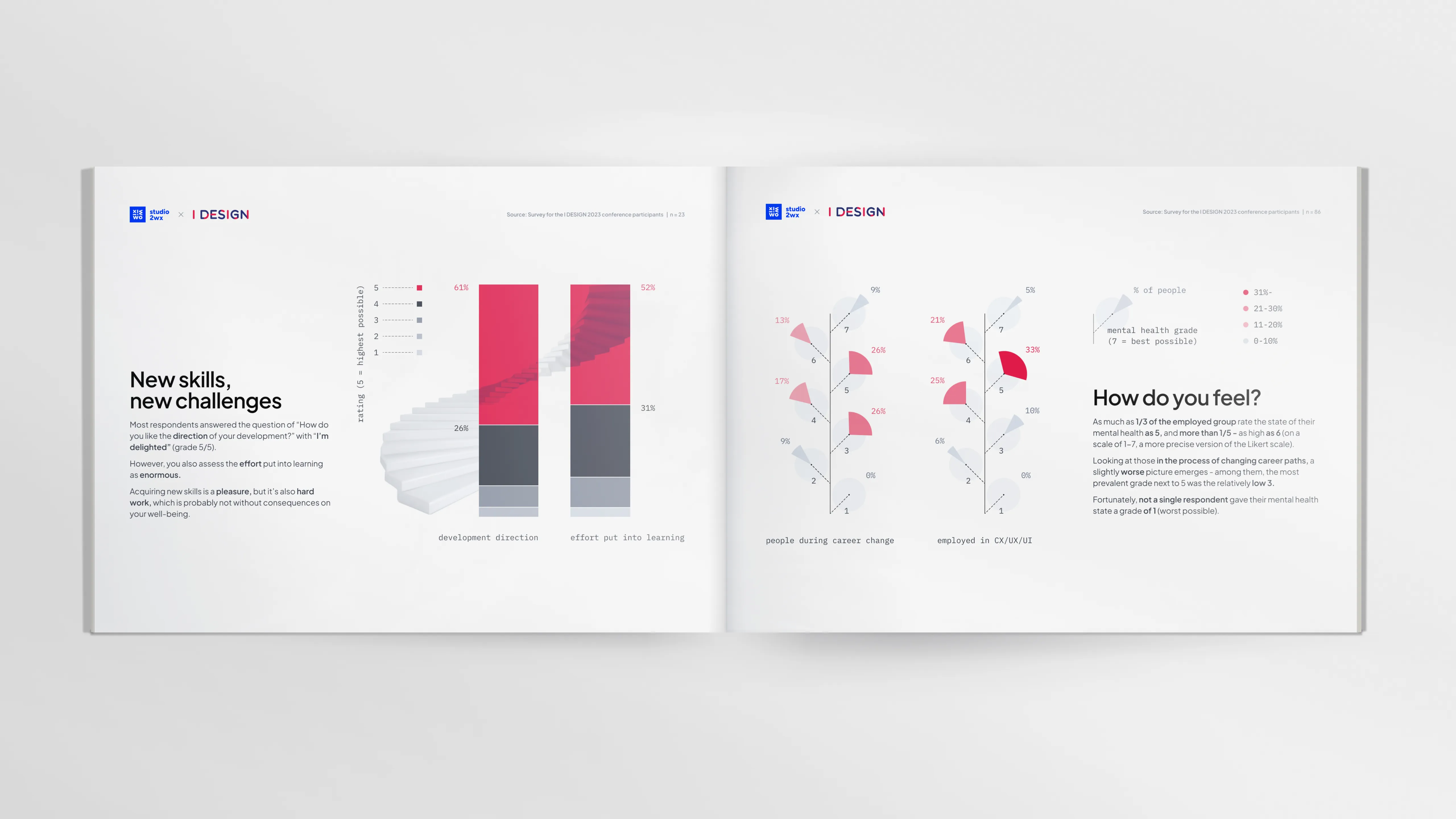
Based on the survey participants’ answers to open questions – which contained, for example, good-humored complaints about uncomfortable chairs – we were able to fine-tune the overall tone of the report, making it calm, but a little playful, with doodles and ‘hand-written’ comments in some places. Along the way, we realized it would also make sense to draw on data from I DESIGN’s social media – to reinforce some of our points, as well as enrich the final product. In its ultimate shape, the report summarizes not only the UX conference, but the entire year 2023 for the I DESIGN society, including its other initiatives and online presence.